For this project, I used Adobe Illustrator to redesign the logo for one of Biola’s on-campus coffee shops, Common Grounds.
Located in La Mirada, Calif., Biola University offers two coffee shops for students: Heritage Cafe with its Starbucks menu, and Common Grounds, which currently serves Stereoscope coffee.
Because Common Grounds has served as a comfortable space to focus and study alone or with friends, and a reliable cafe for me, I wanted to give back to the shop and redesign its logo.
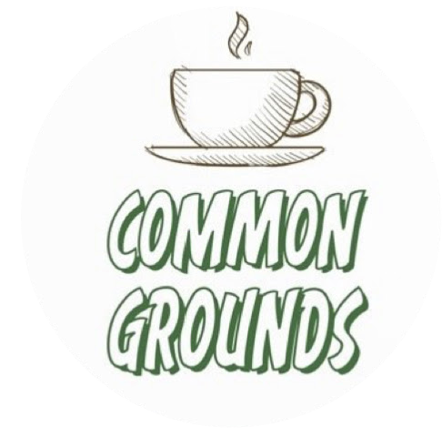
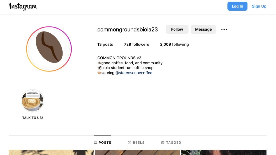
From its encircled “CG” logo outside the window to the minimalistic “Biola COMMON GROUNDS Coffee” sign on the door, I gathered the cafe did not have an official icon associated with their brand. On Instagram @commongroundsbiola23, their current profile photo is a teacup on a saucer, with pea-shaped steam floating above it.
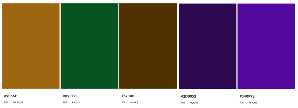
I maintained a similar color palette of green and brown using Adobe Color to keep the consistency so consumers could still easily recognize the brand after a logo refresh.
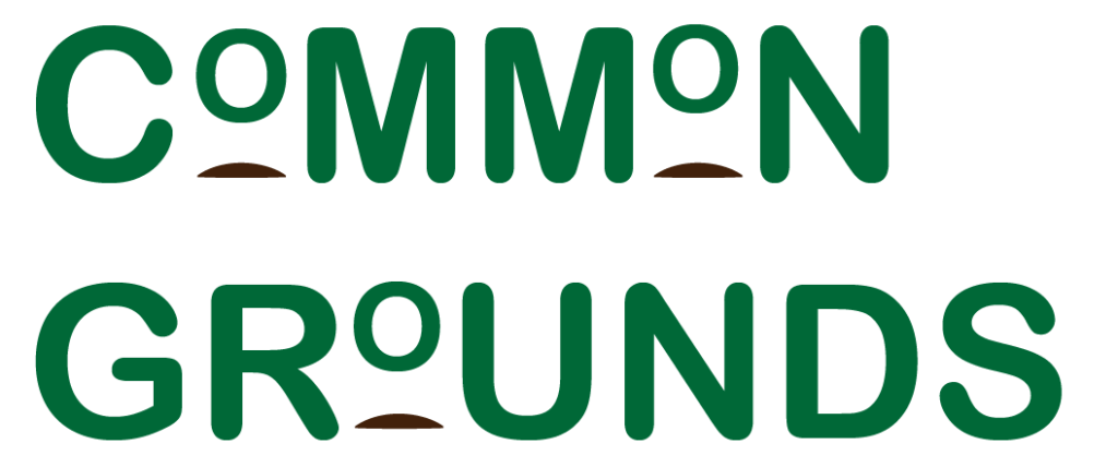
In my redesign process, I first interpreted “grounds” as the dirt ground that coffee beans are grown in, so I highlighted the O’s in “Common Grounds” with a small mound of dirt beneath it. To do this, I used the Touch Type tool in Adobe Illustrator to manipulate the size of, and kerning between, letters (see Draft 1).
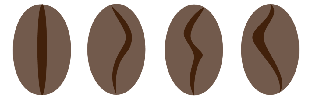
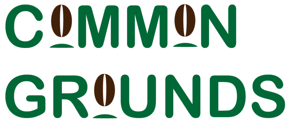
On the one hand, that design seemed too simplistic. On the other hand, it seemed too complex with the dirt mounds. For a more minimalist attempt, I interpreted “grounds” literally as coffee beans using Adobe Illustrator’s pen tool and Pathfinder function, and replaced all the O’s in “Common Grounds” with coffee beans (see Draft 2).
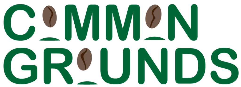
At this point in my creative process, I experimented with a quirky font, GoodKitty, from Adobe Fonts to highlight the independent, alternative aesthetic of Common Grounds. I combined this idea with Draft 2, and created Draft 3 from this idea.

After some feedback from peers (including a surfboard-related comment), I worked to redesigned the bean from an almond shaped center to a more organic shape with depth, thanks to distinctions in color.


With these new and improved beans, I applied them to my initial logo. Although this was an improvement from the surfboard beans, now I thought they looked more like dinosaur eggs (see Draft 4).
Now that I had valuable beans, though, I began experimenting with a more minimalist, comfortable aesthetic. I did not alter the size of the individual letters this time, but I paired them with the beans I had created to ultimately land on Draft 5.
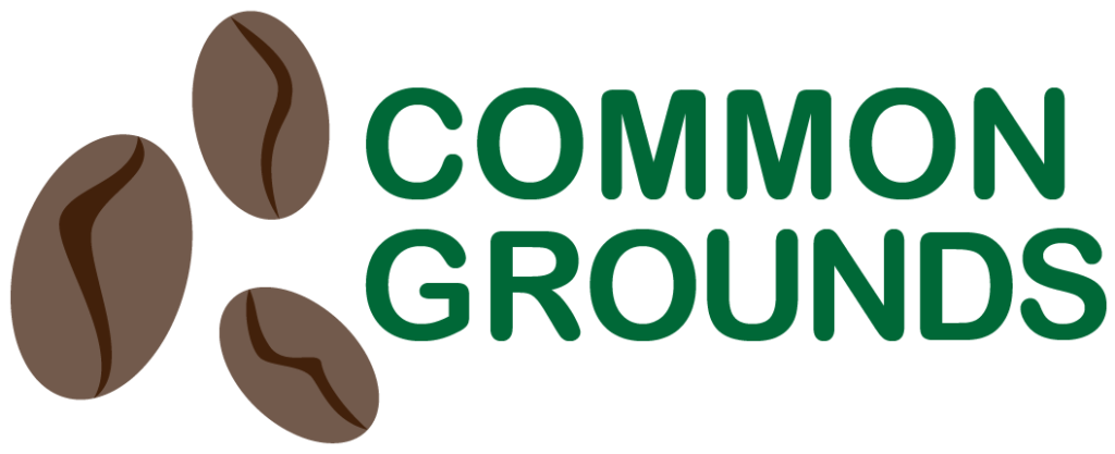

With this final logo, I created mock ups in Adobe Illustrator for Common Grounds’ Instagram profile photo and a coffee cup sleeve design.

Although I don’t anticipate Biola University adopting my new logo, I do think it improves and clarifies Common Ground’s vision for their customers, to serve quality drinks and coffee, especially with these new beans.